I was the sole product designer on this project, conducting all research, interviews, and design myself over the span of about three weeks in May 2023.
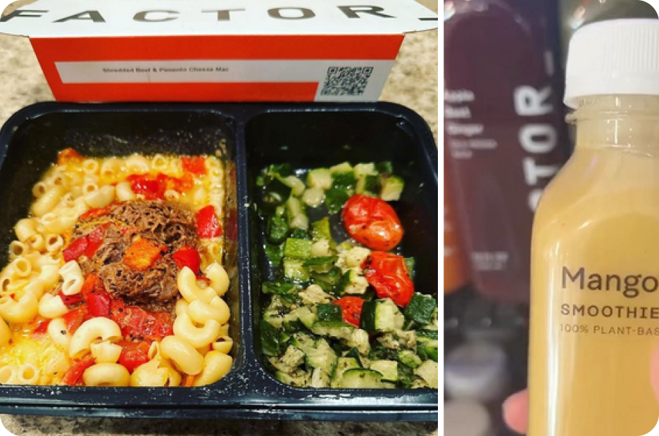
Factor is a subscription-based meal service that sends a box of ready-made meals to subscribers’ doorsteps on a weekly basis. It works similarly to their parent company Hello Fresh—but instead of sending ingredients, Factor ships fresh, pre-cooked meals that are ready to eat after just two minutes in the microwave.
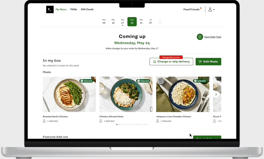
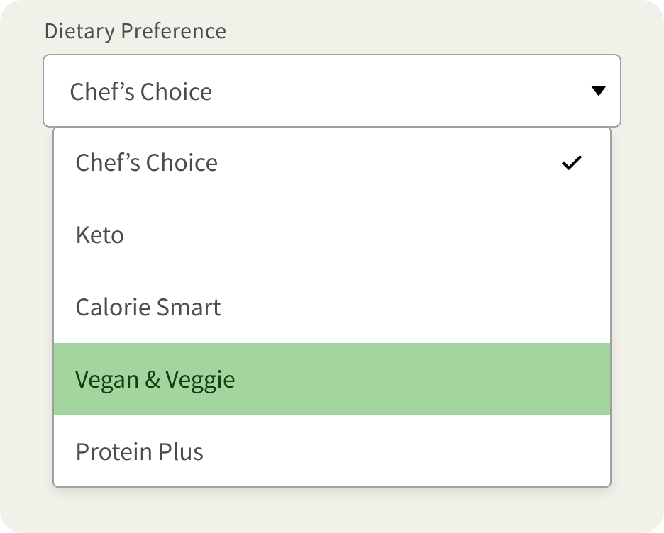
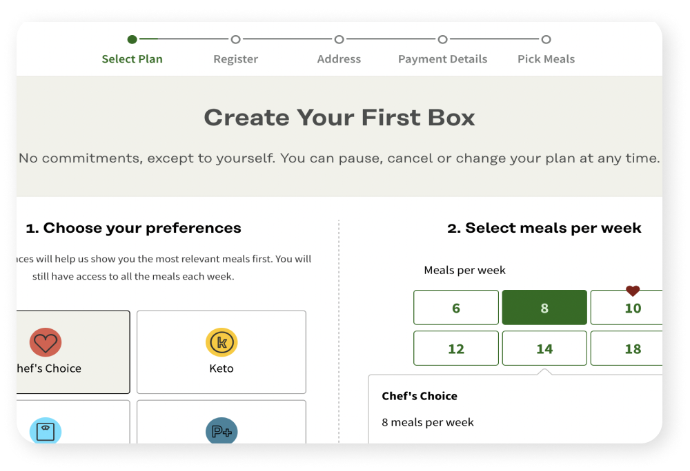
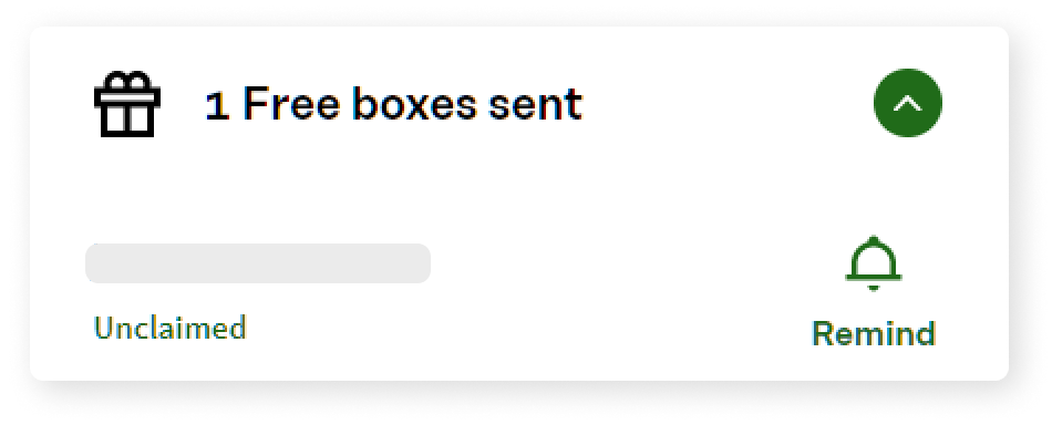
Currently there is only the option for one user per plan to select all 4-36 meals in each box they receive. If the user does not make their own selections, meals will be pre-selected for them based on a single chosen Dietary Preference.
By tailoring Factor’s digital product to better accommodate for multiple dietary preferences, and multiple devices, within a single household, we might be able to expand the appeal of the product to families who need more options.

While many of the people I spoke with have tried meal subscription boxes, very few of them had ever kept their subscriptions for longer than a month. One user even jokingly referred to them as “podcast products.”
How might we might we encourage subscribers to incorporate Factor boxes into their lifestyle long-term, without having to change anything about the service or the price?
In my recruiting, I made sure to specify that I was looking to speak with users who:
-
Have experience with Meal Subscription Boxes, and
-
Have shared the food with another person
I was able to speak with three users in virtual interviews, and I received six responses on a survey that was pushed out across social media and to subreddits specific to these services.
Three of my participants had experience with Factor specifically, one of which has been using Factor for the last nine months.

-
A lack of time or energy for groceries or cookingRespondents were often software engineers, students with demanding internships, or parents who work from home.
-
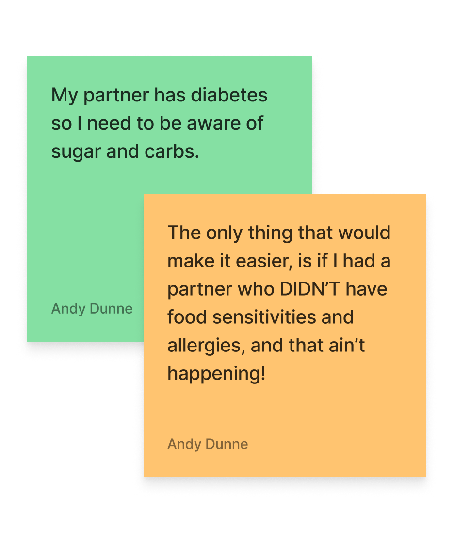
A desire to meet nutrition goalsCombined with a lack of time - “Left to my own devices, I’ll use the same amount of money to hit up a drive through for something so much less nutritious,” as one user put it
-
Sheer curiosityMany users started their subscriptions out of the desire to try new recipes and ingredients they wouldn’t otherwise think to choose or shop for on their own.
Looking at Factor’s current production process, I realized there was very little we could accommodate for feature-wise. As it stands, it would not be safe to advertise any meals as allergy-friendly, as they are all produced in the same facility.
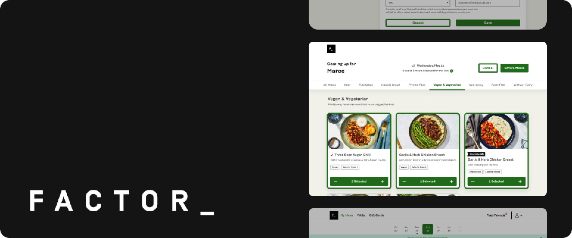
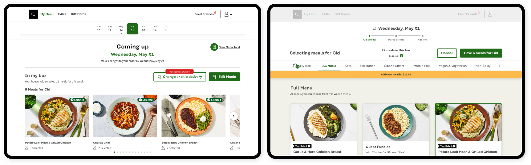
I tied everything - the task flows, the prototype, and my testing script - to the story of Cid and Marco, a couple of young professionals who are so busy that they often forget to choose their Factor meals until the last minute.
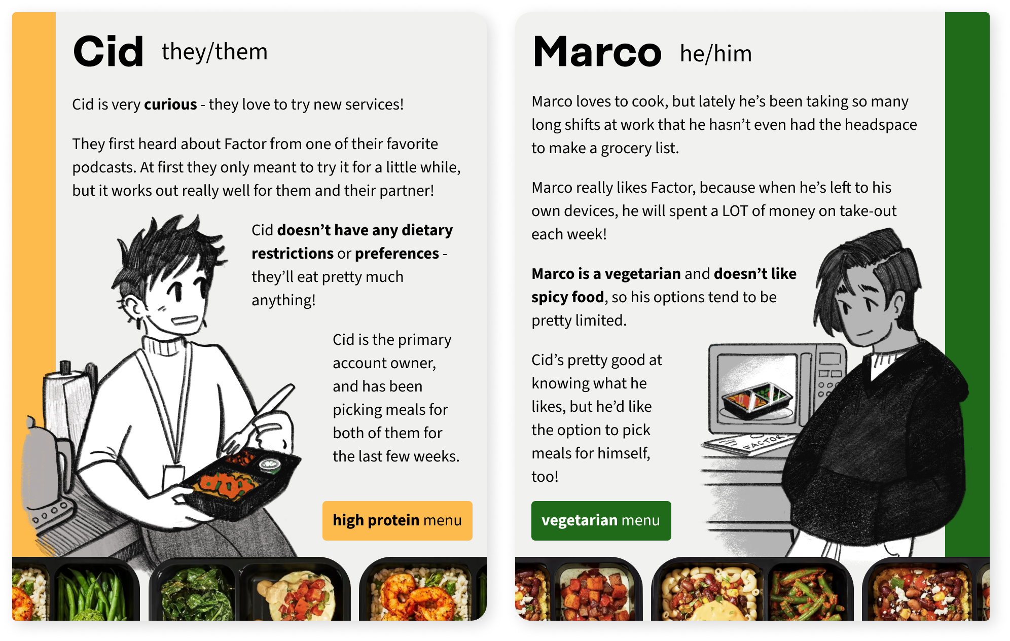
This way, a set number of meals will always be Vegetarian for Marco by default, even on weeks when they forget to choose manually.
Upon clicking each week’s link, they will be taken to a limited dash view where they can select from the upcoming menu. After confirming their selections, they will have the option to stay and edit additional meal selections two menus into the future.

In a v2, I would further differentiate between Cid and Marco’s steps, perhaps by making the progress bar more prominent, or potentially color-coding their selections.
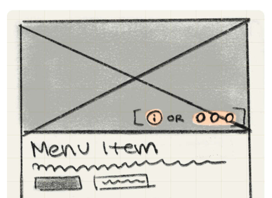
Most testers were not aware that the nutritional info for each meal would be available by clicking its image. By adding a subtle icon over the images, first-time users will have a better understanding that they are clickable in the first place.


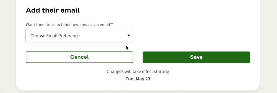
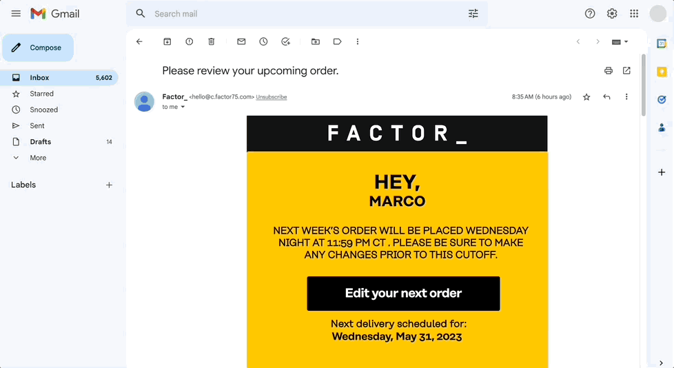
All testers expressed the same expectation, even those who did not pause to read any copy: Marco will receive an invitation to connect with the primary account, and from then on out he will be able to select meals via links in his email.
Some users assumed that Marco will have to set his own login, with limited access to the account. Initially I had designed this feature to work similarly to the links provided in Uber Eats’s group order feature, where limited information is presented to the secondary user via a link that eventually expires - but if more security is necessary, that could be added into the flow.
All flows tested with a 100% task completion rate, with time spent on each screen averaging less than 9.4 seconds.
I would update it to have a more tab-like appearance, so that users both immediately recognize that it is clickable.
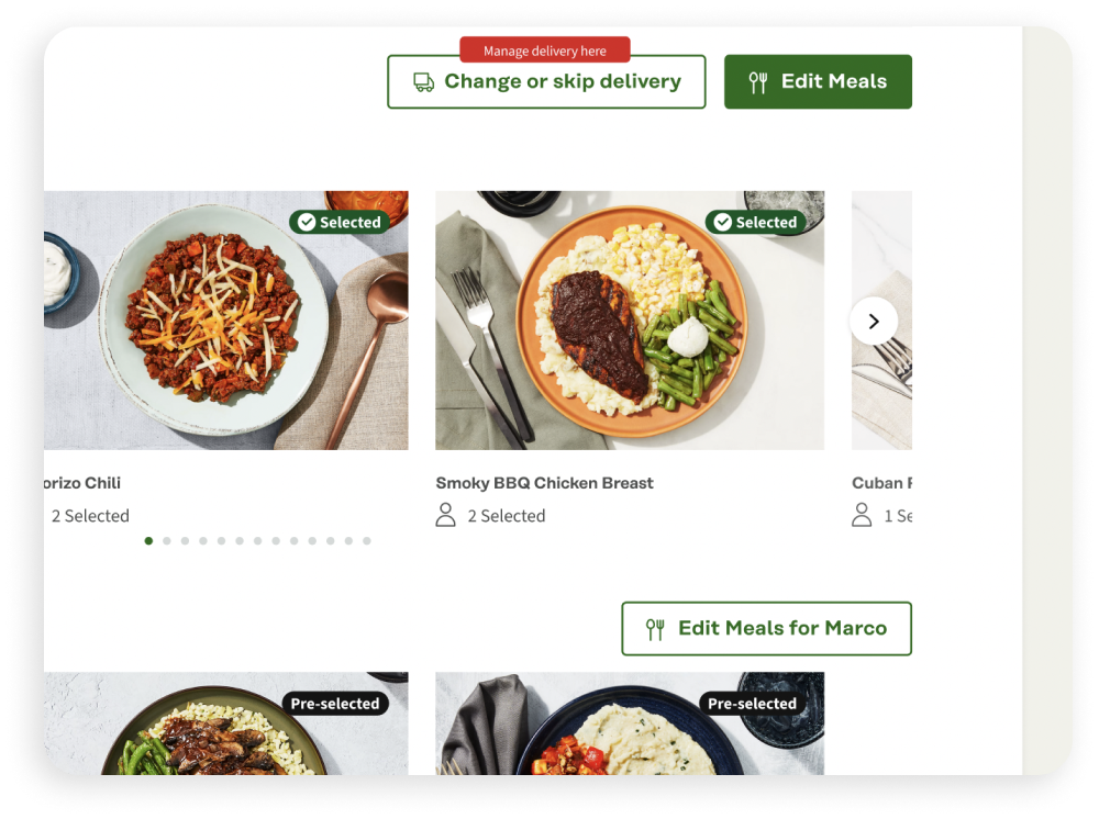
This way, the primary user wouldn’t have to click through potentially 5 different steps just to edit a single person’s meals.
Both testers and my peers at Designlab often had trouble differentiating between elements I had designed for this feature and what was a part of the existing UI kit, so that was an enormous success for this capstone’s brief.
As a current Factor subscriber myself, I really wish this feature existed for my household! Any Factor subscriber I’ve been able to put the design in front of has expressed the same sentiment, so to me, the project was a great success.
